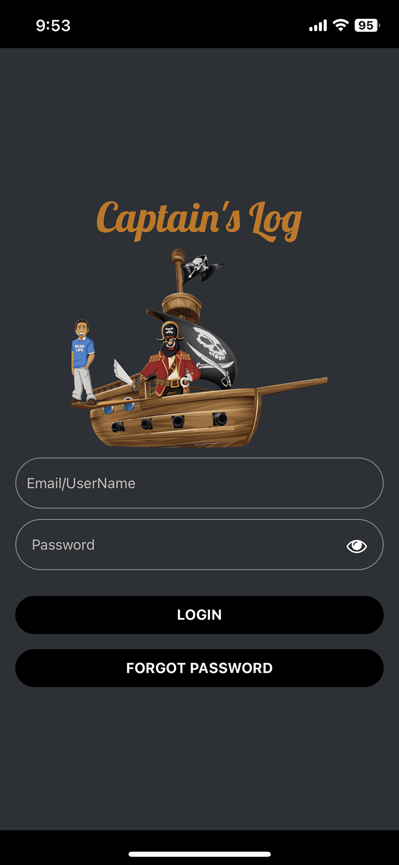
Captain's Log
Captain's Log
Bringing key features front & center to block spam callers in a few taps
Bringing key features front & center to block spam callers in a few taps
ROLE - PRODUCT DESIGNER
User Interviews
Information Architecture
Usability Testing
High Fidelity Mockups
UI Kit
COLLABORATORS
Stephen B. - Founder, CEO
Roger A. - Founder, CTO
James S. - Engineer
TIMELINE
8 weeks
TIMELINE
8 weeks
COLLABORATORS
Stephen B. -
Founder, CEO
Roger A. -
Founder, CTO
James S. -
Engineer
ROLE - PRODUCT DESIGNER
User Interviews
Information Architecture
Usability Testing
High Fidelity Mockups
UI Kit


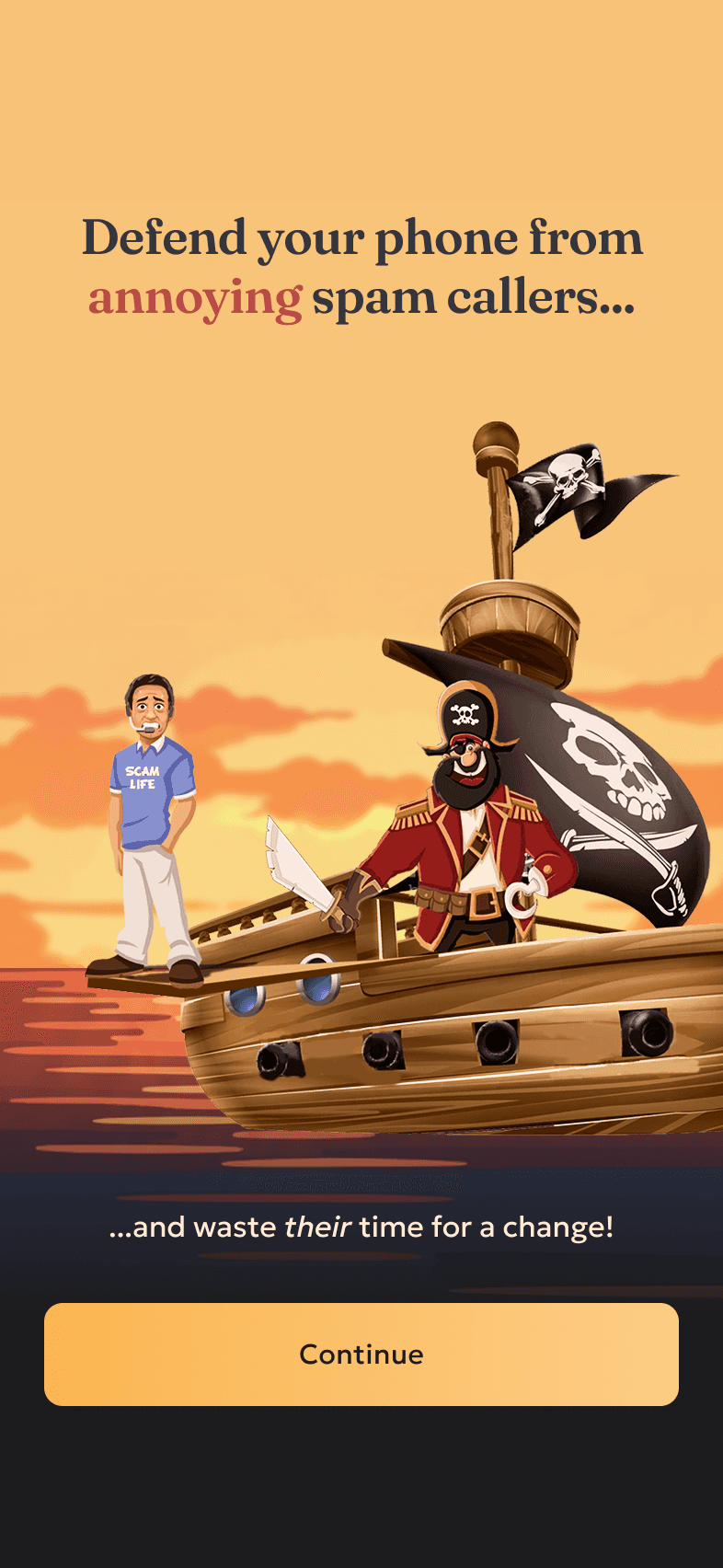
Spam calls are one of modern life's most persistent annoyances.
Captain's Log offers a satisfying solution.
Spam calls are one of modern life's most persistent annoyances.
Captain's Log offers a satisfying solution.
Spam calls are one of modern life's most persistent annoyances. Captain's Log offers a satisfying solution.
Background
Background
Captain's Log allows users to deploy pirate-themed AI bots to intercept spam calls, then listen to recordings of frustrated telemarketers getting strung along.
Captain's Log allows users to deploy pirate-themed AI bots to intercept spam calls, then listen to recordings of frustrated telemarketers getting strung along.
Challenge
Challenge
User retention was suffering due to critical UX gaps:
Some core features only existed on the web, forcing users to jump between platforms
An outdated & buggy interface was eroding trust, even among satisfied users
Confusing navigation made it difficult for users to find & use key features
User retention was suffering due to critical UX gaps:
Some core features only existed on the web, forcing users to jump between platforms
An outdated & buggy interface was eroding trust, even among satisfied users
Confusing navigation made it difficult for users to find & use key features
Plan
Plan
Implement missing web features, streamline the navigational structure, & refresh the app's visual language.
Implement missing web features, streamline the navigational structure, & refresh the app's visual language.
Goal
Goal
Earn back the trust of their current users & attract a younger tech-savvy audience to achieve sustainable growth.
Earn back the trust of their current users & attract a younger tech-savvy audience to achieve sustainable growth.
Identifying core issues to address
Identifying core issues to address


Visual overload
The cluttered interface made it hard for users to quickly scan & find what they needed. Too much competing for attention at once left people unsure where to focus.

Features hidden behind too many taps
The Settings tab had become a maze of features buried several layers deep. People had to dig through multiple menus to find basic controls, making simple tasks feel complicated.
Untitled
Google Play Store
Lex S
Rudimentary app, but it does the job. Keep in mind, most of the settings for the service are available on the website and not in the app.
No Whitelist/Blacklist feature
Apple Store
ed zachary
Without the ability to whitelist or blacklist callers (a feature available on the website), this app is only marginally useful. Listening to the recordings is only fun for a while, but eventually it gets old. But blocking callers to get through the spam filters is what I need to access on a daily basis. Please update to add this ability!
Horrible Execution
Apple Store
gingerjeepher2.0
I wanted to love it, but the concept execution is awful. Both this app and the website are clunky, difficult to navigate, and reminds me of early dialup internet where everyone had a homepage that was "under construction".
Trapped between devices
App store reviews showed many users felt stuck switching between the app & website to complete basic tasks. People loved the concept but the constant platform-hopping was driving them to cancel.
Auditing the current experience
Auditing the current experience
I began by examining user flows, interface patterns, & app store feedback to identify friction points that could be contributing to the retention crisis.
I began by examining user flows, interface patterns, & app store feedback to identify friction points that could be contributing to the retention crisis.
Untitled
Google Play Store
Lex S
Rudimentary app, but it does the job. Keep in mind, most of the settings for the service are available on the website and not in the app.
No Whitelist/Blacklist feature
Apple Store
ed zachary
Without the ability to whitelist or blacklist callers (a feature available on the website), this app is only marginally useful. Listening to the recordings is only fun for a while, but eventually it gets old. But blocking callers to get through the spam filters is what I need to access on a daily basis. Please update to add this ability!
Horrible Execution
Apple Store
gingerjeepher2.0
I wanted to love it, but the concept execution is awful. Both this app and the website are clunky, difficult to navigate, and reminds me of early dialup internet where everyone had a homepage that was "under construction".
Trapped between devices
App store reviews showed many users felt stuck switching between the app & website to complete basic tasks. People loved the concept but the constant platform-hopping was driving them to cancel.
Features hidden behind too many taps
The Settings tab had become a maze of features buried several layers deep. People had to dig through multiple menus to find basic controls, making simple tasks feel complicated.

Visual overload
The cluttered interface made it hard for users to quickly scan & find what they needed. Too much competing for attention at once left people unsure where to focus.
Understanding what could drive adoption
Understanding what could drive adoption
Since one of our goals was to attract new/younger users while retaining the current base, I interviewed 6 participants (ages 29-65) with varying experience using spam-filtering services. I wanted to learn how they currently dealt with spam calls & what would motivate them to use a product like Captain's Log.
Since one of our goals was to attract new/younger users while retaining the current base, I interviewed 6 participants (ages 29-65) with varying experience using spam-filtering services. I wanted to learn how they currently dealt with spam calls & what would motivate them to use a product like Captain's Log.
What users wanted
What users wanted
What users wanted
Text over audio
Users wanted convenient summaries & transcripts after spam calls to quickly scan/search content
Users wanted convenient summaries & transcripts after spam calls to quickly scan/search content
Desire for control
Users feared missing important calls by blocking too much, & wanted to control what kinds of calls could bypass the bots
Users feared missing important calls by blocking too much, & wanted to control what kinds of calls could bypass the bots
Simple navigation
Users felt frustrated by how the current spam-blocking apps they used (like T-Mobile & ActiveArmor) buried the features they used most often
Users felt frustrated by confusing UI in current spam-blocking apps they used
Solution #1
Creating a consistent experience across any device
Solution #1
Creating a consistent experience across any device
Implementing missing web feaures
Implementing missing web feaures
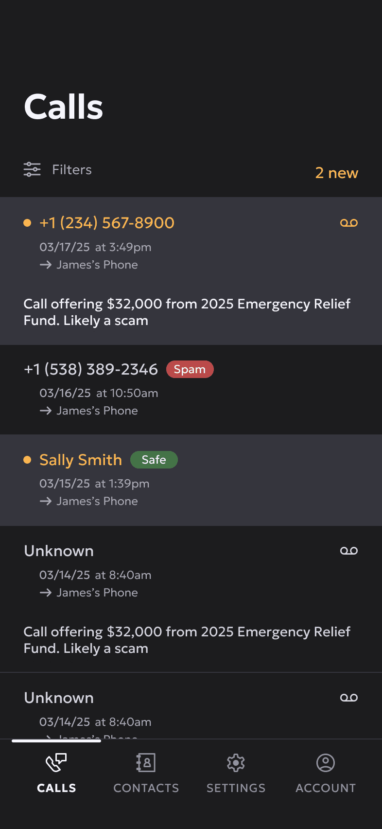
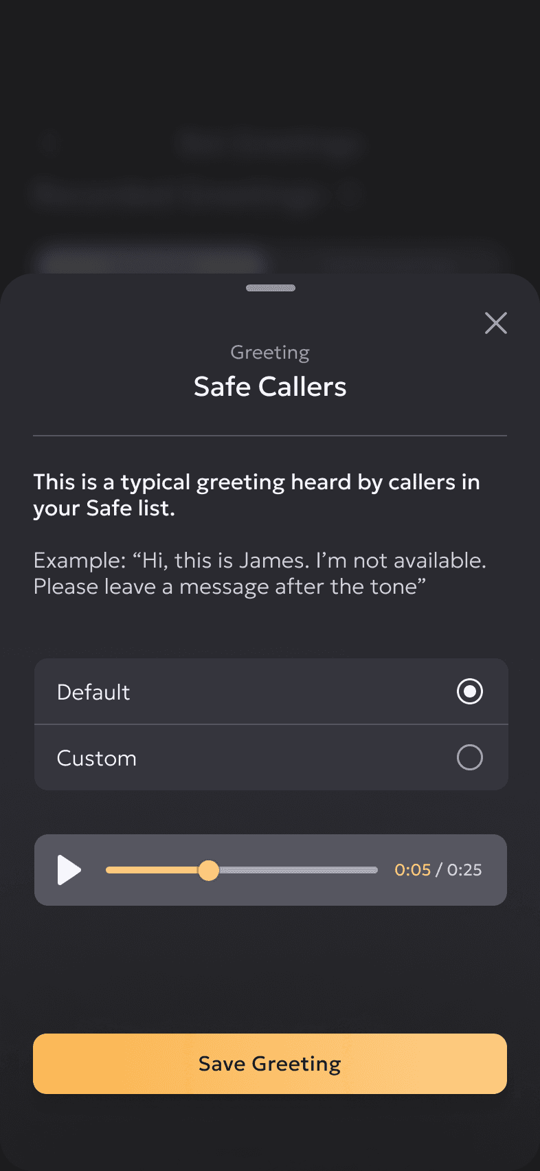
With the redesign, users no longer have to jump between the app & website to manage their spam protection. Contact lists grant users the control they need over which calls are filtered; transcripts make content accessible for users with hearing impairments while providing the text-based convenience everyone wanted.
With the redesign, users no longer have to jump between the app & website to manage their spam protection. Contact lists grant users the control they need over which calls are filtered; transcripts make content accessible for users with hearing impairments while providing the text-based convenience everyone wanted.
Summaries & Transcripts
Safe & Spam Contact Lists


Solution #2
Putting key features within a tap
Solution #2
Putting key features within a tap
Streamlining the navigational structure
Streamlining the navigational structure
To establish a baseline for the information architecture's effectiveness, I conducted tree testing with the existing 3-tabs, asking 10 participants to locate core features. After using the results to restructure the IA, I ran the same test with 10 new participants to measure improvement.
To establish a baseline for the information architecture's effectiveness, I conducted tree testing with the existing 3-tabs, asking 10 participants to locate core features. After using the results to restructure the IA, I ran the same test with 10 new participants to measure improvement.
Before

51% average success
The Settings tab had become a catch-all for unrelated content, creating confusion around account-level versus line-specific features.
After

74% average success
Now 4 tabs with clearer groupings: dedicated Contacts tab, streamlined Settings for phone line-level management, & Account for notifications & high-level app settings.
Multiple line management made easy
Multiple line management made easy
Because users can manage spam protection for multiple phone lines under one account, I ran a usability test to make sure there was no lingering confusion around where account-specific versus phone line-specific features were located.
Because users can manage spam protection for multiple phone lines under one account, I ran a usability test to make sure there was no lingering confusion around where account-specific versus phone line-specific features were located.
What users did
What users did
Split on where line-level info should be located
Split mental models on phone line info
Participants were equally split on whether 'Phone Line Info' belonged under Settings or Account tabs
Participants were equally split on whether 'Phone Line Info' belonged under Settings or Account tabs
Participants were equally split on whether 'Phone Line Info' belonged under Settings or Account tabs
Couldn't find 'Spam Protection Level' setting easily
There was confusion between turning protection on/off versus viewing current settings.
There was confusion between turning protection on/off versus viewing current settings.
There was confusion between turning protection on/off versus viewing current settings.
Most testers rated the app as "Easy to use"
“Everything felt very straightforward. I was unfamiliar at first but it was simple to figure out where everything is.”
“Everything felt very straightforward. I was unfamiliar at first but it was simple to figure out where everything is.”
“Everything felt very straightforward. I was unfamiliar at first but it was simple to figure out where everything is.”
Before
After
Solution #3
Making a better first impression
Solution #3
Making a better first impression
Refreshing the visual language
Refreshing the visual language
The updated UI signals to users that this is a reliable, current product worth investing in. At the founder’s request, legacy pirate graphics were preserved & thoughtfully woven throughout the redesign. This approach maintains the brand’s distinctive pirate identity while delivering a contemporary experience.
The updated UI signals to users that this is a reliable, current product worth investing in. At the founder’s request, legacy pirate graphics were preserved & thoughtfully woven throughout the redesign. This approach maintains the brand’s distinctive pirate identity while delivering a contemporary experience.
Before


After

Outcomes
Outcomes
23%
improvement in successful navigation to core features
Users find what they need faster & more easily, all without switching devices.
Users find what they need faster & more easily, all without switching devices.
75%
testers rated the app "Easy to use"
No more getting lost in menus. Most users navigated the app smoothly, describing the experience as straightforward & easy.
No more getting lost in menus. Most users navigated the app smoothly, describing the experience as straightforward & easy.
Anticipated impact
Anticipated impact
While it's too early to report impact on cancellation rates & user growth, we expect to see a reduction in cancellation requests, increase in monthly active users (MAU), & increase in new subscriptions. We also expect the updated interface to boost user perception & trust.
While it's too early to report impact on cancellation rates & user growth, we expect to see a reduction in cancellation requests, increase in monthly active users (MAU), & increase in new subscriptions. We also expect the updated interface to boost user perception & trust.
Other projects
Before Coffee


Karicell

LOCT


Other projects
Before Coffee
Karicell
LOCT
Other projects
LOCT
Before Coffee