Before Coffee
Before Coffee
Before Coffee
Paving the way for new foot traffic to a local coffee shop
Paving the way for new foot traffic to a local coffee shop


ROLE - DESIGNER
User research
Website design
Framer build & handoff
SEO implementation
STAKEHOLDERS
Shop Owner
TIMELINE
4 weeks
TIMELINE
4 weeks
STAKEHOLDERS
Shop Owner
ROLE - DESIGNER
User research
Brand strategy
Website design
Framer build & handoff
SEO implementation
Before Coffee is a laid-back Brooklyn coffee shop with excellent drinks & a loyal local following.
Before Coffee is a laid-back Brooklyn coffee shop with excellent drinks & a loyal local following.
Background
Background
Despite their success, Before Coffee had no digital presence beyond sporadic Instagram posts, limiting their reach in a market where customers discover new spots online.
Despite their success, Before Coffee had no digital presence beyond sporadic Instagram posts, limiting their reach in a market where customers discover new spots online.
Challenge
Challenge
The shop needed a website that would attract new customers searching for coffee shops in the area. It needed to hit the digital sweet spot between the owner's minimalist aesthetic vision & what research showed customers actually wanted in terms of personality & authentic vibes.
The shop needed a website that would attract new customers searching for coffee shops in the area. It needed to hit the digital sweet spot between the owner's minimalist aesthetic vision & what research showed customers actually wanted in terms of personality & authentic vibes.
Plan
Plan
Conduct user research to understand how people discover coffee shops, design a website that balances clean minimalism with genuine personality, & build a mobile-optimized site on Framer
Conduct user research to understand how people discover coffee shops, design a website that balances clean minimalism with genuine personality, & build a mobile-optimized site on Framer
Goal
Goal
Expand Before Coffee's reach beyond walk-by foot traffic by establishing a digital presence that drives new customer visits.
Expand Before Coffee's reach beyond walk-by foot traffic by establishing a digital presence that drives new customer visits.
Understanding customer expectations
Understanding customer expectations
User interviews with locals
User interviews with locals
Because I also live in NYC & am part of the shop's core demographic, I knew people in the area tend to have strong opinions & preferences on how they choose local businesses to patronize. Through interviews, I learned a few key elements must be included in the website to influence this demographic to actually visit the shop.
Because I also live in NYC & am part of the shop's core demographic, I knew people in the area tend to have strong opinions & preferences on how they choose local businesses to patronize. Through interviews, I learned a few key elements must be included in the website to influence this demographic to actually visit the shop.
Design pillars to entice new customers
Design pillars to entice new customers
Vibes
Menu
Photos
Pillar #1
Vibes speak volumes
Pillar #1
Vibes speak volumes
I'm more attracted to places that are local & have some sort of cultivated aesthetic.
Interview participant
Customers are driven by aesthetics
Customers are driven by aesthetics
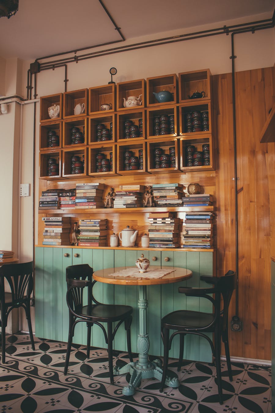
All people interviewed mentioned the "vibe" of a place being important in forming a snap judgment of a shop they haven't been to. Customers are drawn to businesses that have a distinct personality.
At the beginning of the project I asked the owner to send any references that he felt would fit Before Coffee's vibe from his POV. The reference sites he shared embodied a vision for something truly minimal. This seemed to be at odds with the type of digital presence his target demo is generally drawn to.
Minimalism requested
Curated aesthetic expected
Balancing simplicity & personality
Balancing simplicity & personality
The final design balances the owner's request for simplicity & his customers' preferences for sites with personality.
The final design balances the owner's request for simplicity & his customers' preferences for sites with personality.


Greens
Greens
Dark Green, used in place of Black, is subtly unexpected while still conveying serenity & freshness. Kelly Green injects energy in small hits.
Dark Green, used in place of Black, is subtly unexpected while still conveying serenity & freshness. Kelly Green injects energy in small hits.
Warm Neutrals
Warm Neutrals
Reminiscent of warm lattes, these tones are more inviting than stark White & balance the cool greens used throughout.
Reminiscent of warm lattes, these tones are more inviting than stark White & balance the cool greens used throughout.
Pillar #2
Menu matters
Pillar #2
Menu matters
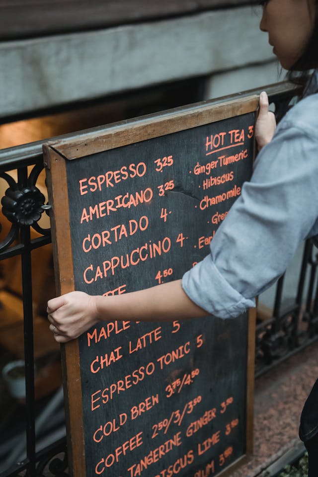
I typically only go to a coffee shop's website to look at their menu, I need to know prices & alternative dietary options to decide if I even want to go.
Interview participant
Testing the mobile menu: tabs preferred
Testing the mobile menu: tabs preferred
Customers often look for pricing & info about dietary substitution options to judge if a shop will fit their needs.
Knowing that most people search for coffee shops on their phones, I prioritized optimizing the menu for mobile from the start. I tested 2 menu layouts through A/B testing with 8 participants to compare tabs versus continuous scroll.
Version A - Tabs
Version B - Continuous
The results slightly favored the tab format; additionally, I learned users found the display of item pricing for different sizes unclear, & they wanted to see seasonal specials to gauge what makes this shop different from the rest.
The results slightly favored the tab format; additionally, I learned users found the display of item pricing for different sizes unclear, & they wanted to see seasonal specials to gauge what makes this shop different from the rest.

Pillar #3
Photos are worth a thousand words
Pillar #3
Photos are worth a thousand words
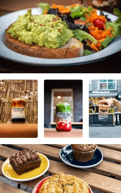
Even if I'm taking my coffee to go, I want to see the vibe of the shop because to me that says a lot about the quality of the coffee.
Interview participant
The constraint: no professional assets
The constraint: no professional assets
For this audience, photos aren't just nice to have. They're the primary way people evaluate whether a shop is worth their time. The visuals need to communicate authenticity & quality before someone ever walks through the door.
However…professional photos & marketing assets weren't available for this project. The shop's only visual content existed as low-resolution images on Instagram. Instead of seeing this as a limitation, I treated it as an opportunity to get resourceful.
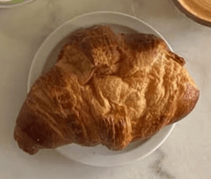
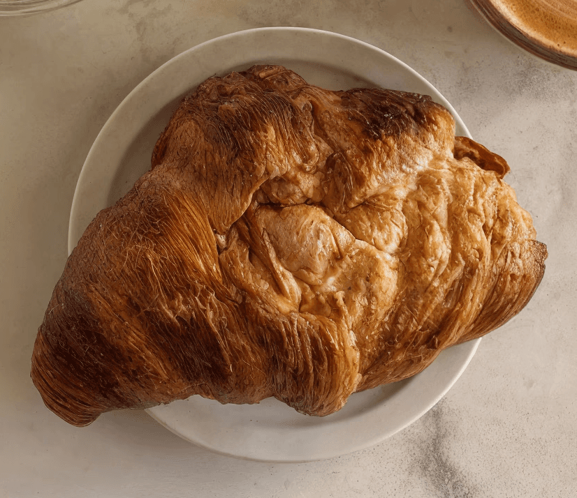

AI to the rescue
AI to the rescue
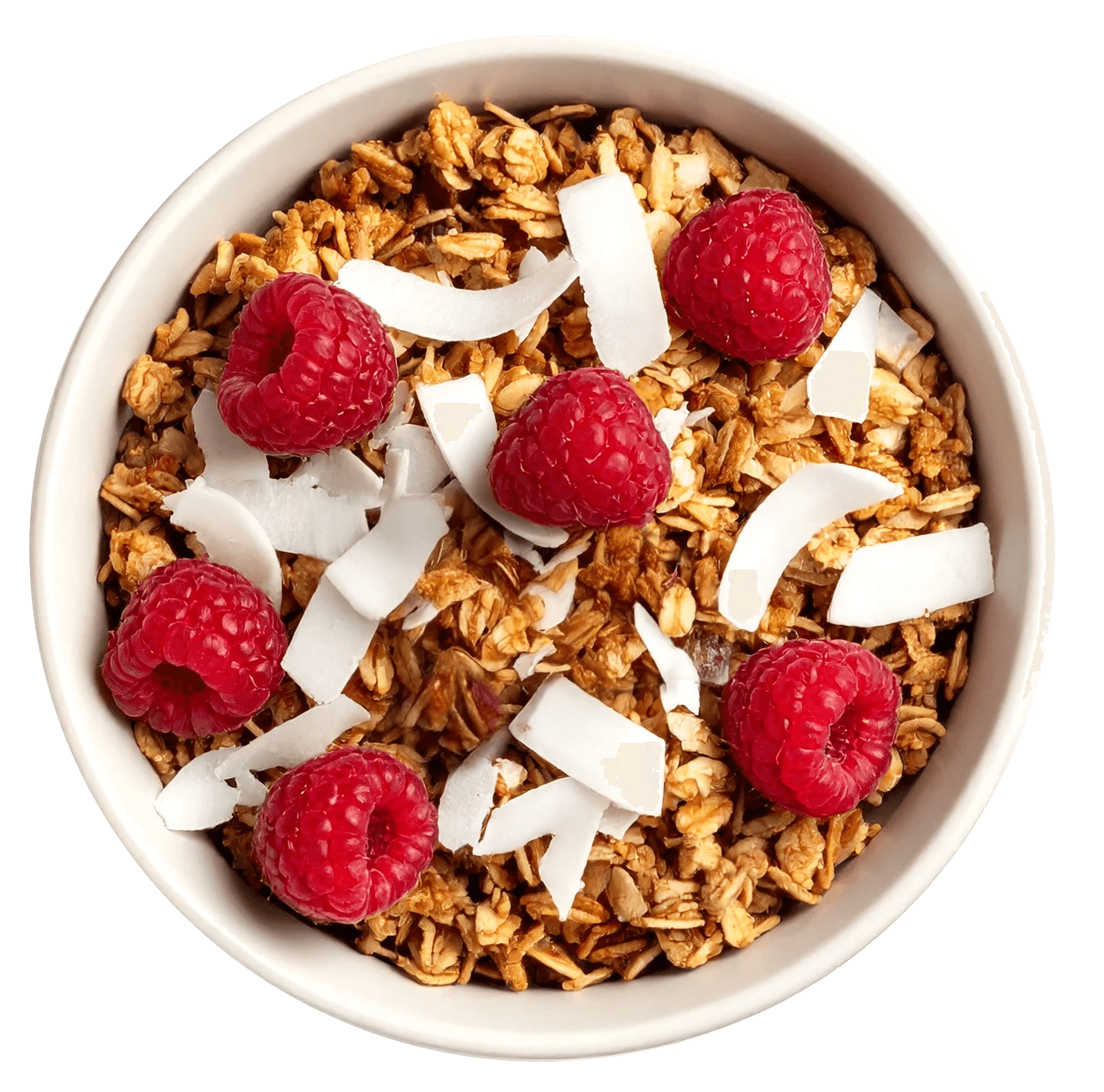
I used Krea to upscale low-resolution Instagram shots for a higher-quality look throughout the site, & Adobe Firefly to generate new assets for the menu pages.
I used Krea to upscale low-resolution Instagram shots for a higher-quality look throughout the site, & Adobe Firefly to generate new assets for the menu pages.
Outcomes
Outcomes
Impact
Impact
Before Coffee now has a digital presence that extends their reach beyond walk-by traffic while staying true to their laid-back identity.
100% of test participants rated the site as 'appealing'. Additionally, the shop now has a scalable foundation for growth, with an e-commerce container prepared for future merch sales.
Karicell


LOCT


Captain's Log
Other projects
Other projects
LOCT
Captain's Log
LOCT
Karicell
Captain's Log
Other projects