

01 - Diagnosing the problem
Before jumping in, I familiarized myself with the app in its current state to suss out the most glaring UX issues.
What I did:
Mapped existing flows
Analyzed app store reviews
Conducted a heuristic evaluation

Many of the heuristic violations pointed to a lack of consistency & standards in design throughout the app. There were also significant efficiency issues, particularly with users having to jump between the app & website to complete tasks or find help documentation. The app in its current state was creating unnecessary friction at every turn.
02 - Aligning stakeholder vision: what success looks like
I facilitated conversations with both co-founders to understand the most pressing issues around user retention & identify who their current audience is versus who they wanted to reach going forward. These discussions revealed three critical priorities:
01 - Prioritize AI summaries & transcripts over audio content to…
Appeal to a younger audience's tendency to scan info
02 - Integrate an onboarding flow to…
Encourage new users to engage key features without being obstructive
03 - Improve the overall navigational experience to…
Reduce the number of cancellation requests
Now we had a north star: we needed to modernize the experience while maintaining what current users loved about the app.
03 - Understanding the competitive landscape
The telecommunications market, & more specifically the spam-blocking niche, was totally new to me. To learn more about where Captain's Log fit in this space, I conducted a competitive analysis of 3 similar products- TrueCaller, Number Shield, & Robokiller.

The analysis revealed interesting positioning opportunities. TrueCaller & Robokiller differentiated themselves from Captain's Log through clean UI, while TrueCaller & Number Shield offered screening assistants that prevent spam calls from reaching users entirely. Captain's Log, however, stood out by allowing users to customize their answering bots & offering competitive pricing.
This competitive insight would prove crucial as we shaped our redesign strategy. We had unique features that could be our competitive advantage if we could just make them more accessible.
04 - The user research challenge: when your audience is hard to reach
Naturally I was eager to interview current users as the authorities on the app's experience. According to stakeholders, these users typically 50+ years old & tend to have cynical attitudes about their data privacy. However, we could only reach users through the app's help portal, & despite many requests, only 2 users responded weeks later.
Those conversations revealed that both users were highly satisfied with playing back entertaining sound bites of frustrated telemarketers interacting with their bots, but otherwise offered little constructive feedback. While positive, this wasn't aligned with the stakeholders' reports of high monthly help tickets & cancellation requests.
This disconnect told me we needed a different approach to understand the full user experience.
04.1 - Pivoting the research strategy: casting a wider net
Since we aimed to attract new & younger users while retaining the current base, I pivoted to interviewing 6 participants (ages 29-65) with varying experience using any spam-filtering telecom services. I wanted to understand how they dealt with spam calls & what would motivate them to use a product like Captain's Log.
Users like having transcripts available to cross-check with recordings
They want flexibility & control over which calls to block
They would find it helpful to receive summaries after spam calls are filtered, to stay in the know without having to answer annoying calls
Fear of missing important "unrecognized" calls by blocking too much
Confusing & disorganized UI in the current apps they use
Cost is a barrier to entry
These insights painted a much clearer picture of the opportunity space & helped validate the stakeholders' priorities while revealing additional user needs.
05 - Building empathy: Meet Cath & Russ
These research findings helped me create detailed empathy maps for two personas: Cath & Russ.
Having these personas became crucial as we navigated the complex feature set & prioritization decisions ahead.


06 - Feature prioritization: bringing focus to chaos
With numerous ideas circulating, I facilitated a virtual workshop with both co-founders & their developer to inventory existing features & evaluate new concepts. I emphasized that all redesign features should address user needs uncovered through research, & we discussed technical feasibility.
This exercise eliminated several ideas & helped define our design scope. Since users can apply spam protection to multiple phone lines under one account, it was also crucial to clarify which features are account-specific vs line-specific—a distinction that would prove critical for the information architecture.
View feature prioritization doc
07- Testing the current structure
Before redesigning the app's architecture, I conducted a tree test of the existing app with 10 participants completing 5 tasks to pinpoint problem areas. Results showed there was confusion in adding callers to Block/Safe contact lists (Task 1) & finding filters for the call log (Task 4).
This data gave me concrete evidence of where the current structure was failing users, providing a foundation for the redesign that would follow.
View information architecture
Results:
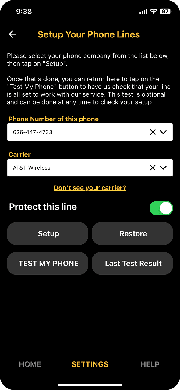
08- Rebuilding the foundation: a new IA
The previous 3-tab architecture was clearly unbalanced, most apparent in the Settings tab's deeply nested pages of somewhat unrelated content. Following conventional navigational patterns, I designed a new IA around 4 main tabs to create logical groupings that matched users' mental models.

Important updates
Contacts
New addition; gives users control in managing callers considered "Safe" or "Spam"
Settings
Reimagined to house phone line-specific information
Account
Repurposed from the previous "Help" tab; houses account-specific features & gives users multi-lateral access to edit phone line details
09 - Validating the new structure
Tree-testing this new IA by having 10 other participants complete the same 5 tasks yielded encouraging results.
The new structure simplified navigating Safe/Spam lists & call log filtering, but increased confusion around finding registered phone lines. 30% of participants expected this under the Contacts tab, suggesting potential task wording issues.
Task: Where would you go to see all the phone lines registered to be screened under your account?
While we couldn't definitively resolve whether this was a wording issue or a structural problem due to unmoderated testing constraints, stakeholders chose not to relocate Phone Line Details within the IA.
10 - Mapping key journeys: bringing clarity to complex flows
With the IA validated, I created detailed user flows for the Onboarding & Safe/Spam List features to align with & guide the developer. These flows served as the blueprint for ensuring consistent, logical experiences across the app's most critical features.


11 - Testing early concepts
After a first round of sketching, I conducted user testing with 8 participants to determine if the Settings & Calls tabs were logically organized & matched users’ mental models. Each participant carried out 3 unmoderated tasks, & answered 2 follow-up questions.

Parameters:
Task 1: Where would you go to see what level of spam protection is set for your phone line currently?
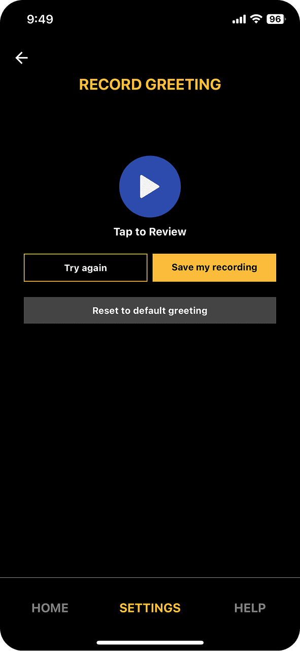
Task 2: Where would you go to update your voicemail greeting for Safe Callers on your phone line?
Task 3: Where would you go to listen to a recording of a call you received?
Tasks 2 & 3 were successful (>50% participants took same path to arrive at correct destination)
75% participants rated navigation difficulty as "Easy" or "Very Easy"
“Everything felt very straightforward. It's a new app so I was unfamiliar at first but it was simple to figure out where everything is.”
Participants frequently tapped the "Spam protection on" toggle when trying to review protection levels
There was still split opinion on whether 'Phone Line Info' belonged under Settings vs Account tabs
Settings: Participants tapped disabled areas before realizing they needed to select a phone line first
"It was unclear whether the level of protection I'd signed up for would be found under Settings, or be tied to my account."
12 - Visual transformation: building trust through design
While improving navigation was the top priority for user retention, the app's outdated visual aesthetic also needed attention. I emphasized to stakeholders how a polished interface builds user trust, affecting retention & satisfaction. They were open to a complete overhaul, with one caveat: I had to preserve the existing pirate imagery to maintain the app's sense of humor.
This constraint actually became a creative opportunity. How could I modernize the interface while maintaining the brand's personality?


13 - Modernizing the Captain's Log identity
Beyond revamping the app's interface, we needed the rest of the Captain's Log brand collateral to match the new design language. I updated the wordmark to Geologica, the main typeface used throughout the interface, which conveys modern approachability. I inserted a custom apostrophe shaped like half of a telephone receiver to call back to their rotary phone & crossbones logo, which they chose to keep to maintain consistency across other branded products.
This rebrand struck the balance between modernization & brand continuity by evolving the identity without losing what made it memorable.


14 - Systematic thinking: building for the future
To promote consistency across Captain's Log, I created a UI Kit with accessible colors, typography, graphics, & reusable components for implementation in this app & potentially their web platform in the future. This library facilitated visual consistency & created a foundation for scalable design decisions.
While still a work in progress, this system would prevent the inconsistency issues that plagued the original app & support future development efforts.

15 - Putting it all together: high-fidelity screens
I worked through multiple iterations of the primary screens, testing different approaches to layout, hierarchy, & interaction patterns. The Call Details screen went through several versions as I balanced the need to surface AI summaries & transcripts with maintaining quick access to core functionality. The Contacts screen required particular attention, as this was a completely new section in the app that needed to feel familiar while offering a slew of features.
16 - High-fidelity validation
To validate my design decisions, I conducted moderated remote usability testing with 5 participants to ensure they could easily access & understand the information on Calls, Contacts, & Settings tabs.

Parameters:
Task 1: You’re checking your call log & see the latest missed call from an unrecognized number is labeled “likely a scam”. How would you add this number to your Spam list?
Task 2: How would you set up a new rule in your contacts list that would classify all incoming phone numbers starting with '1317' as a "Safe" number?
Task 3: Where would you go to find out more information about the specific level of spam protection set for James’s phone line?
Tasks 1 & 3 were successes (>60% participants rated the tasks as "Easy" or "Very Easy")
All participants struggled with finding the "New Pattern" button on Task 2, describing it as "buried" or "hidden".
Participants without prior experience with similar products needed more guidance & context, saying they would like to have an onboarding tour of the app
Mental models around Settings vs Account information remained split, even after knowing this product has account- & line-specific settings
View full report
17 - Back to the drawing board
Based on the test findings, I prioritized 2 revisions:


18 - A note on onboarding
One major limitation I uncovered with stakeholders: users will not be able to create or delete accounts on the mobile app, due to stakeholders' desire to avoid app store fees associated with subscription transactions.
Far from ideal, however I uncovered an opportunity to still give users some control by including a temporary Cancel Trial option for new users within the first 30-day period of their account. Below, annotations left for the developer on this interaction.


19 - Measuring success: a nuanced outcome
While it remains to be seen how successful this redesign will be at retaining users & attracting new ones, we did bring the interface up to date through new design language & clearer organization of features.
Through initial testing, we found the updated IA to be 25% easier to use compared to the old structure. While we hoped this number would be higher, my conversations with "new" users revealed that this product is inherently niche & will have a learning curve as users understand all the available features.
20 - Looking forward: the real test begins
Although it was disappointing to not be able to reach actual app users for testing during our research & design sprints, we will be prioritizing focused outreach to get their thoughts on how this new design addresses their pain points.
Ultimately, the real impact will be apparent once Captain's Log 2.0 launches & we can monitor key metrics. We expect to see a reduction in cancellation requests, increase in monthly active users (MAU), & increase in new subscriptions.
View the next project: